Explore
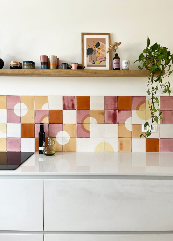
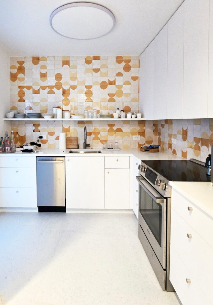
Our client spent over a year looking for the right visual element for an all-white, minimalist kitchen that needed a touch of colour and personality.
Colours: 007, 008, 010, 304 on a soft white base glaze.
Credit: @kell.rology
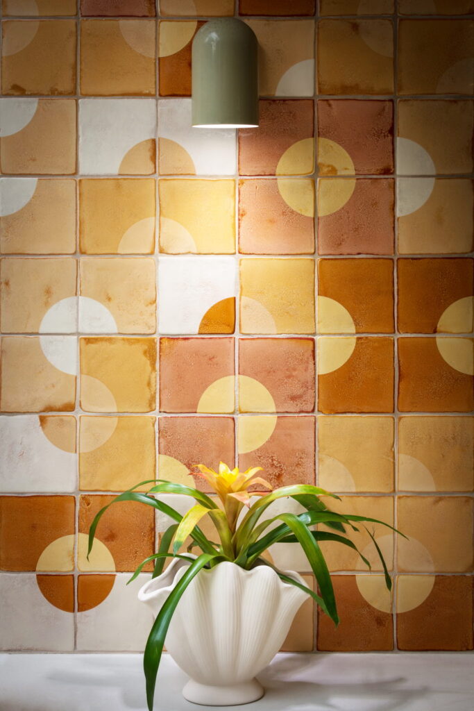
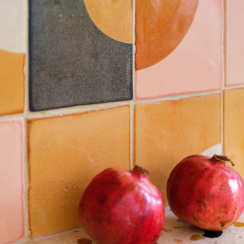
Close up, the effect of screen-printing on the back of the tile becomes clear. As the surface is more irregular, the colours ‘pool’ more, creating an interesting, vintage-like surface. Particularly suitable for large spaces and works perfectly outdoors.
006, 007, 008 and 304 on a cream base glaze.
Landscape design and build: @designbybrookside
Photography: @emma_a_photo
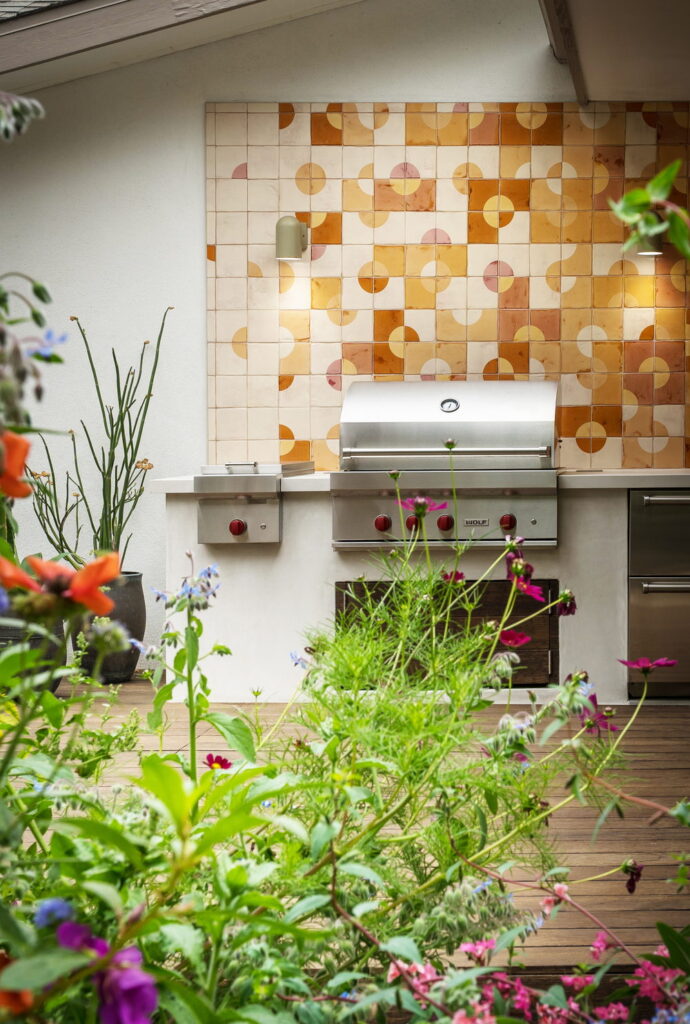
Tiles outdoors have to cope with weather as well as cooking, and glazed ceramic handles both, which is why this outdoor kitchen uses the same tiles we would use indoors. The design that we created for the project contains a gradient and the client chose to have the glazing and screen-printing on the back of the tile for a more textural look and feel.
006, 007, 008 and 304 on a cream base glaze.
Landscape design and build: @designbybrookside
Photography: @emma_a_photo
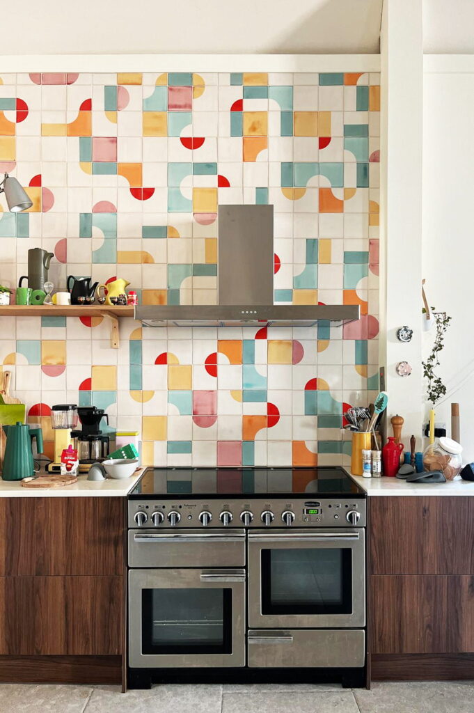
This is a full wall backsplash is in a converted church on a Scottish island with striking windows. Our client chose a mix of six specific colors and a layout that embraced a natural sense of playful disorder.
Colours: 006, 301, 302, 304, 505, 506 on a soft white PPWM base glaze.
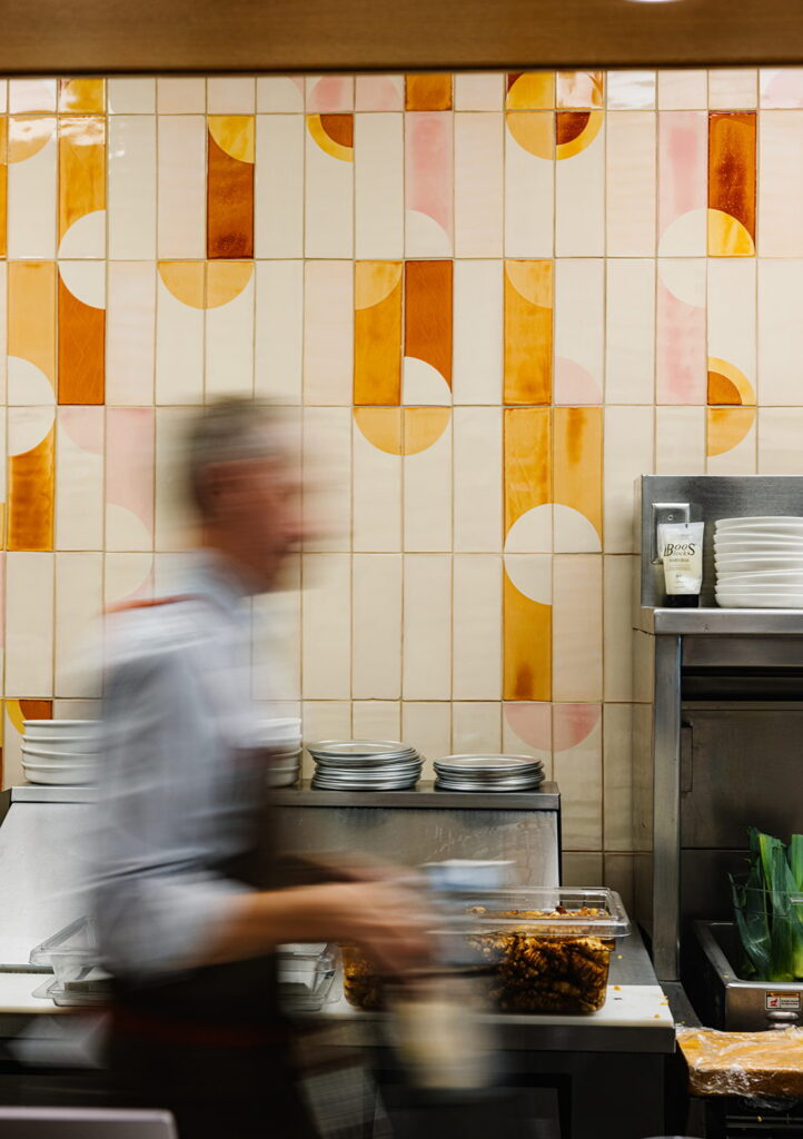
Our client used Smink Studio tiles an the open kitchen backsplash for their new tapas restaurant in North Carolina, USA. Featuring a large street-facing window the tiles give more than decoration to the restaurant, they are part of the identity and branding, even finding their way, in stitched pattern form, onto the aprons that staff wear.
006, 007, 008, 307 on a cream PPM6 base glaze. Also a solid matte glaze M998.
Restaurant Proximo, NC, USA @proximonc
Photography: Anna Routh Barzin @annarouth
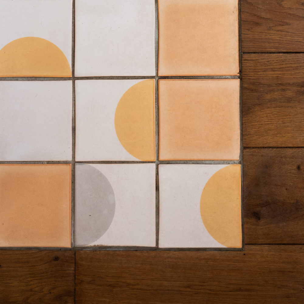
For this Dutch beach restaurant, project our client came to us with a clear vision for a warm, seventies French vintage aesthetic. As the tiles are on the floor, the glaze is matte.
005, 006 and 007 on a matte white base glaze.
@beachclub.c.noordwijk
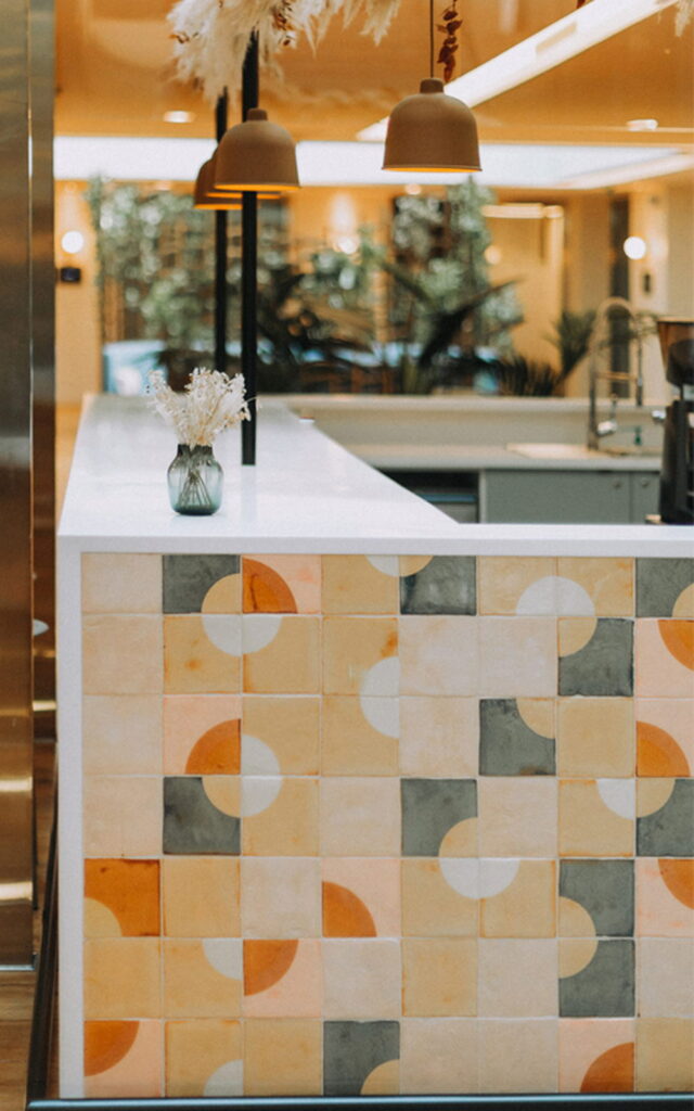
The client chose to have these tiles glazed and screen-printed on the more textural back of the tile. This lends a more vintage look to the tiles and makes them beautifully strokable.
006, 007 and 308 on a cream base glaze.
Design: Mathilde Lavrilleux @mathilde.lvllx
Studio Morning @morning.fr
Photography: Valentin Bourdiol, Studio Gatse @studio.gatse
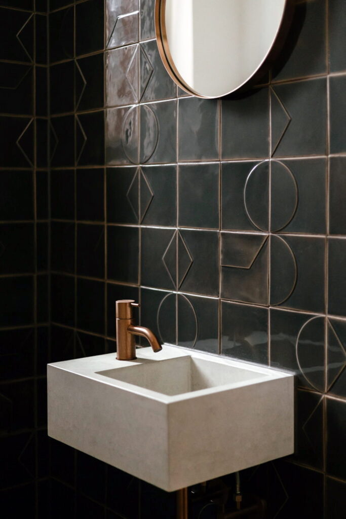
This is a Relief tile installation in a single charcoal glaze (B028). In a small room this is a useful way to get pattern without adding overwhelming colour, and it leaves the concrete basin and the copper tap to do the contrasting.
Design: Imraum Design @gestaltung.imraum, imraum.design
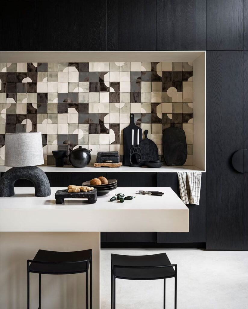
Dark tiles can deaden a room but here the mix of cream and grey over a dark glaze lends depth to the tiling. This installation was created as the dream home of VT Wonen stylist Marianne Luning.
VTWonen Magazine
Styling and photography: Marianne Luning
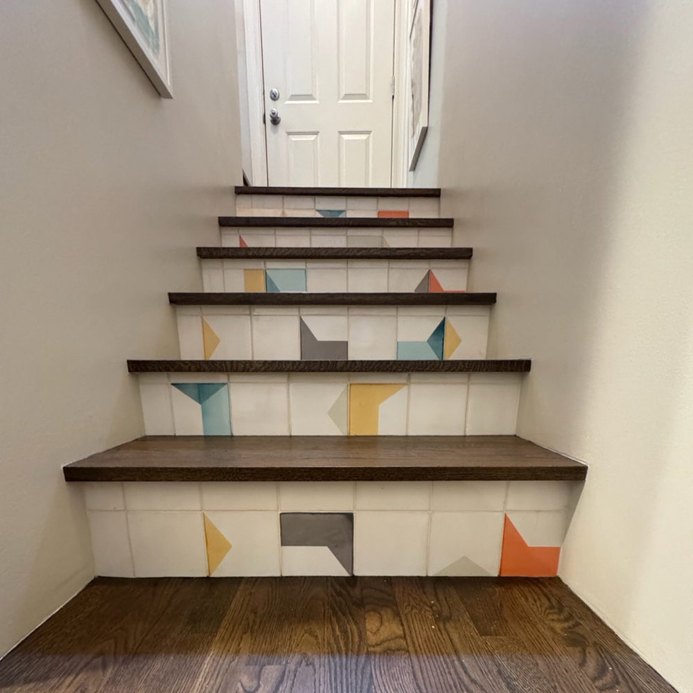
Tiling the risers of a staircase and leaving the treads in oak means the pattern is only visible from head on and above, which is an unusual way to see tiles. The shapes are geometric rather than rounded, printed in teal, mustard, grey and orange on white, and each riser is its own small composition while the flight holds together as one.
Colours: 006, 101, 300, 408, 505, 506 on a soft white PPWM base glaze.
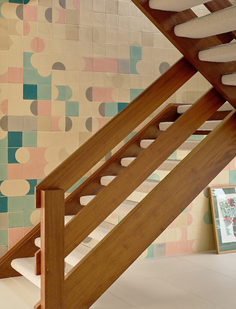
Our clients’ choice for this double-height hallway wall was pastel-ish colours on a cream matte base glaze. Most of our projects use gloss for the walls but here because the size of the tile installation could have produced too much reflected light.
Colours: 101, 105, 200, 201, 308, 410 on a cream matte base glaze.
Photography: Eric Orme, Place Photography @placephotog
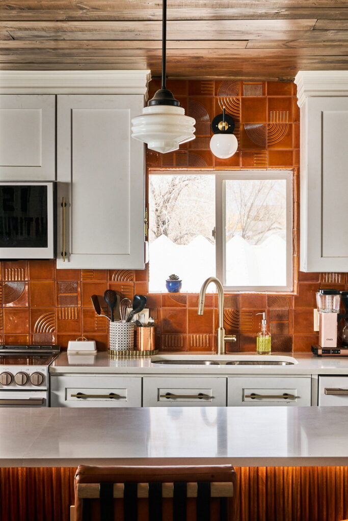
These are Relief tiles, so the pattern is pressed into the clay rather than printed onto it, and the arches and lines appear more strongly when the light crosses them. The client chose a warm caramel glaze and a personal touch emerged when the client requested a small rainbow shape somewhere above the stove as a fun feature for their daughter.
Glaze: B054 Creme Caramel
This bar, located next to the rooftop pool in the W Hotel Hollywood, takes its inspiration from the theme of sunrise, with the warm scheme here running through orange, red and a yellow-cream. A white base glaze was chosen over cream so the wall would stay fresh against the light fabrics nearby.
Colours: 006, 008, 300, 301, 307 on a soft white PPWM base glaze.
Location: W Hotel Hollywood @whollywood
Design: Rockwell Group @rockwellgroup
Photography: Michael Kleinberg
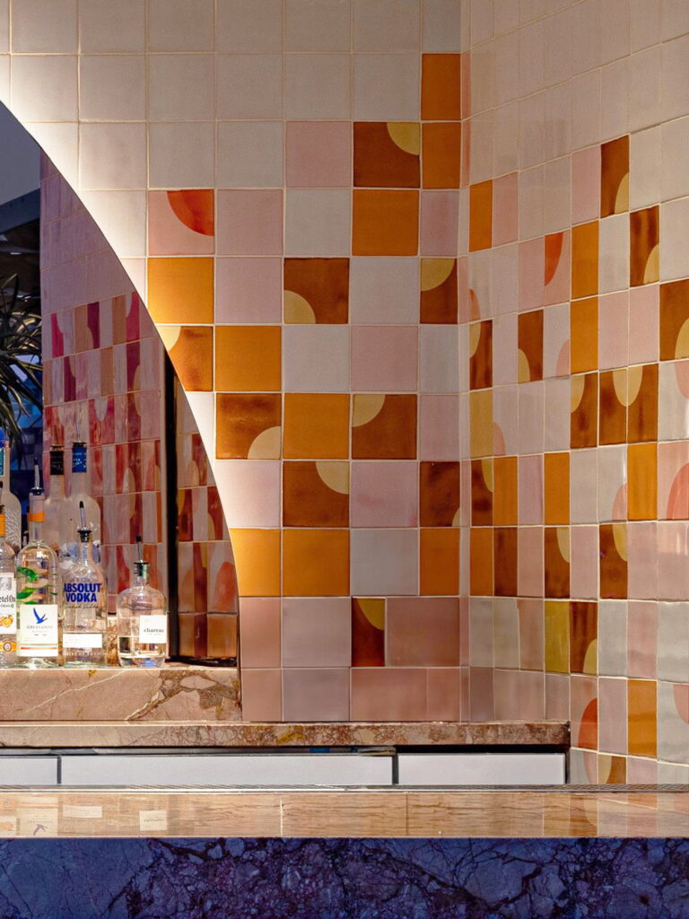
After landing on a vibrant five-color palette, the first proposal for this project was a little too intense. To make it feel more open and playful, the design was adjusted to include a percentage of solid white tiles, so ending up with a design that feels fresh and cohesive.
Colours: 005, 309, 310, 502, 503 on a soft white PPWM base glaze.
Interior design: Studio Incognita @studioincognita
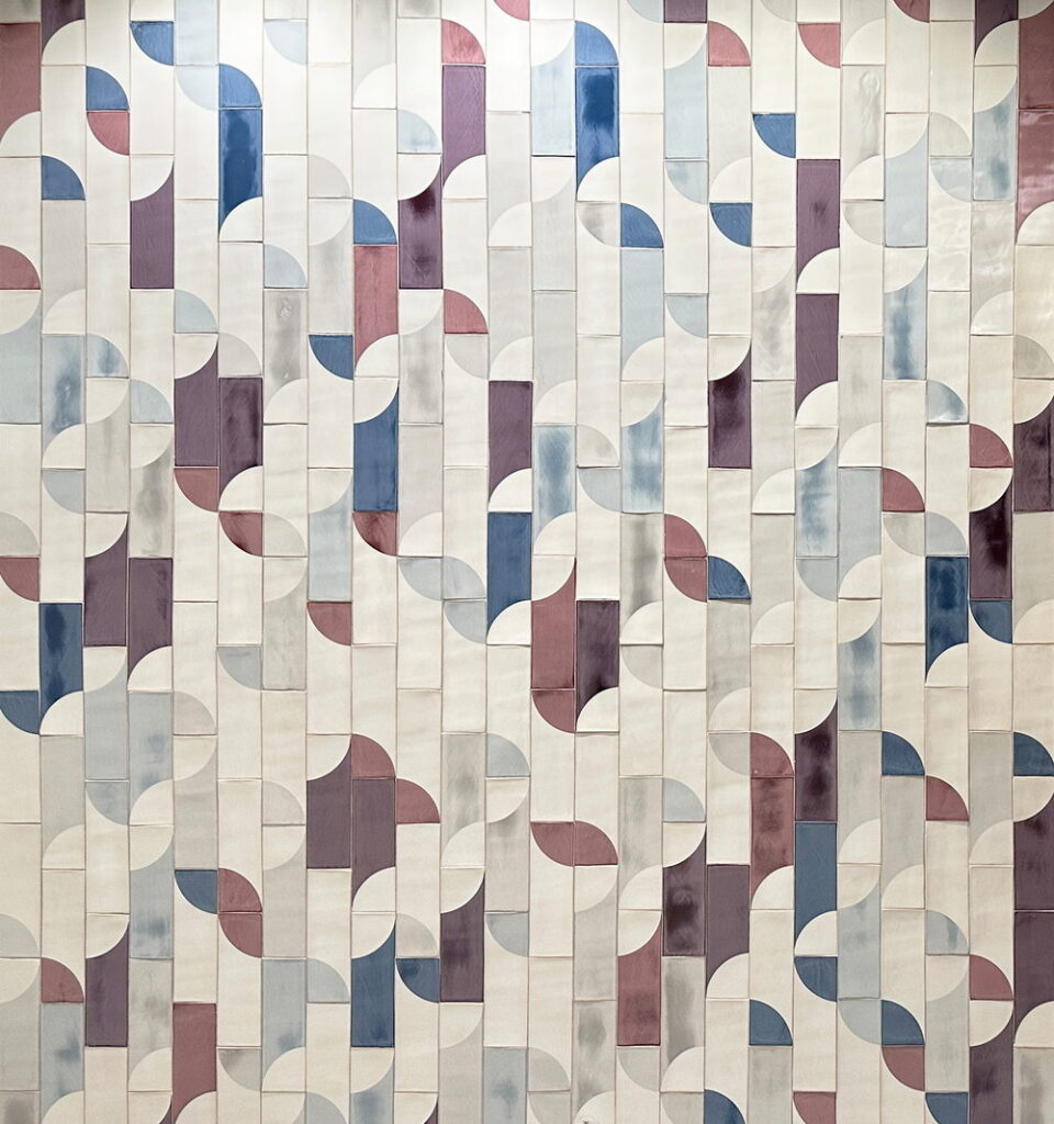
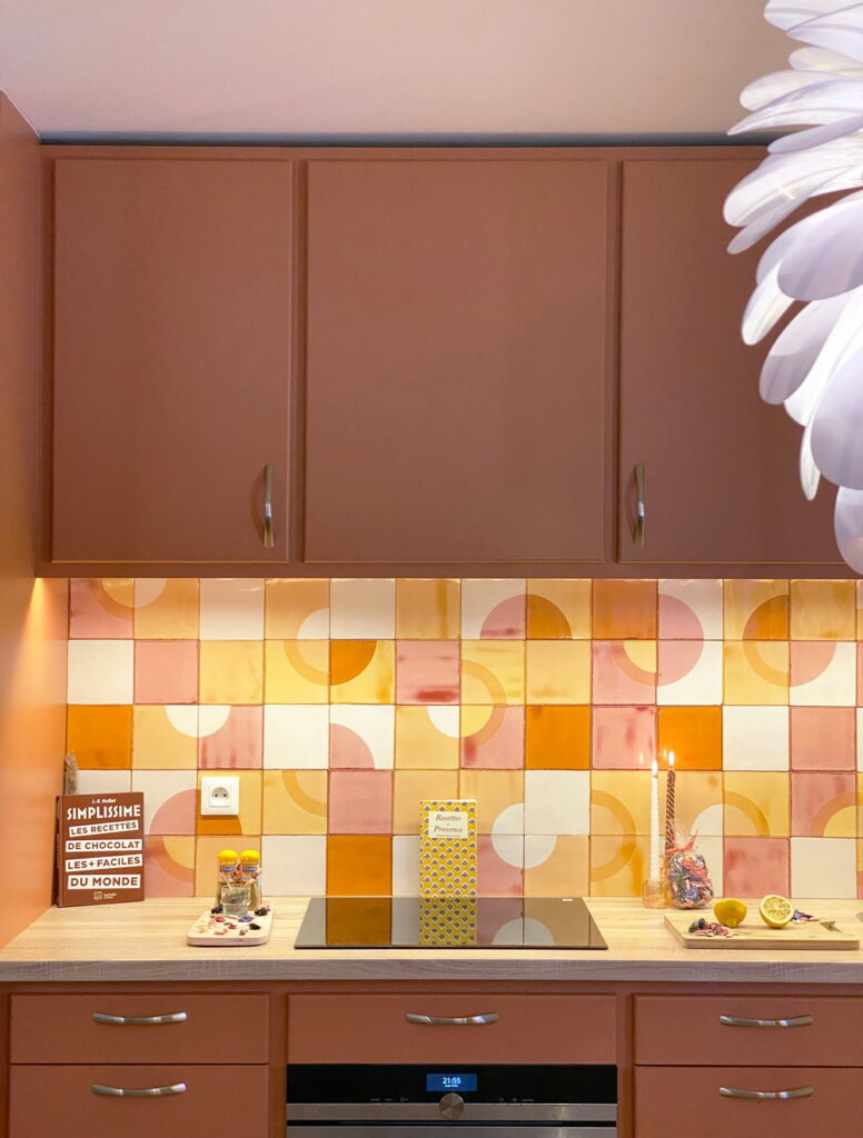
The splashback picks up the terracotta of the cabinets above and below it but adds in half-circles and three-quarter circles in pink, mustard and cream, so the wall becomes less solid than the units. The layout was designed for this kitchen before anything went into production.
Colours: 006, 007, 008, 304, on a white PPWM base glaze.
Architecture: LaFourcade Architecture, architecture-lafourcade.com
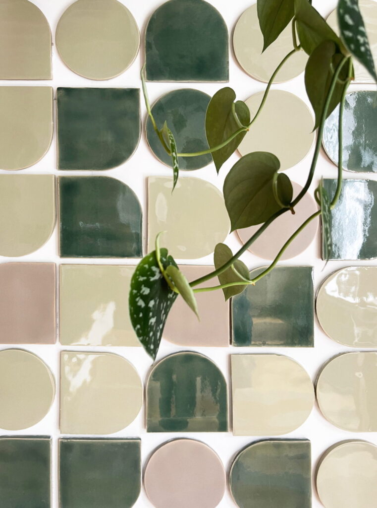
Unlike normal square tiles, these tiles have a shape: circles, arches and squares with a single rounded corner. They can be glazed in any of our Relief solid glazes (minimum 3m2 / 33sf per glaze). Here the glazes are sage, olive, and a pale blush. The spaces between the tiles can be left open or filled with a natural material such as lime mortar.
Glazes: M885, B089, B628
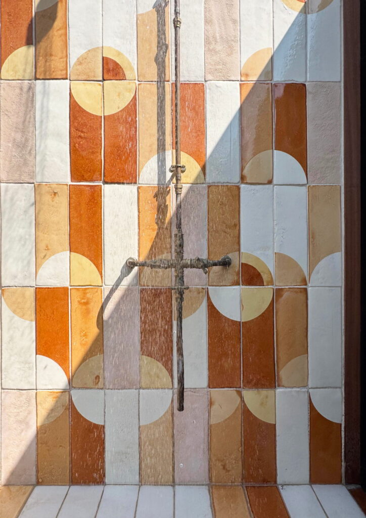
An outdoor shower puts glazed ceramic in direct sun, which suits these colours: the terracotta and mustard warm up as the light moves across them. The textural, rougher-than-normal surface of the tiles is achieved by glazing the back of the tile.
Colours: 006, 007, 008 and 307 on a cream base glaze.
Photography: Abi Campbell @abicampbellphotography
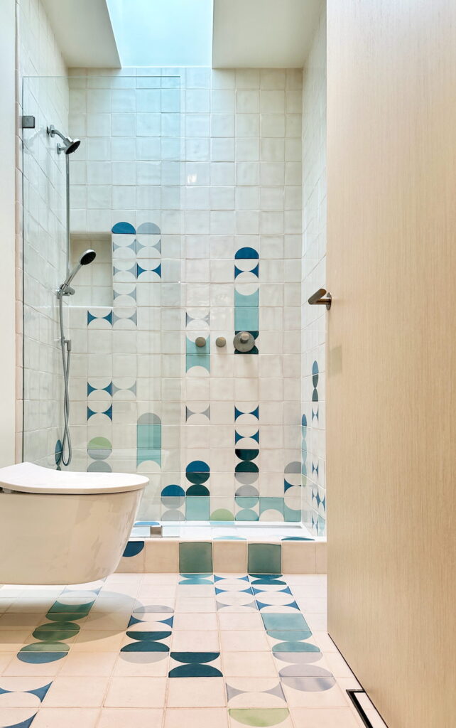
This design is deceptively simple. In fact there are 42 different kinds of tile required to create this installation. One reason is that the tiles on the floor are matte while the tiles on the wall are gloss. We recommend matte for floor applications as it offers more slip-resistance when wet. The other reason is that the curb and the niche needed various bullnose finishing to achieve the satisfying, rounded installation that you see in this picture.
Colours: 201, 203, 502,505, 509 on a soft white base glaze.
Design: Open Studio, openstudio.design
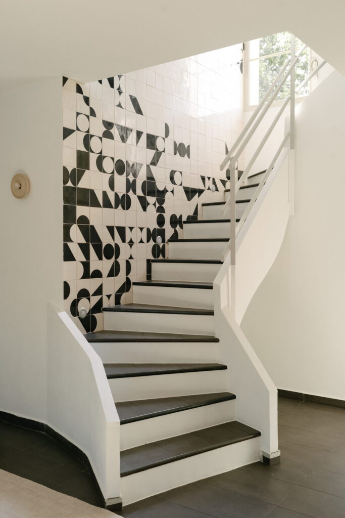
In this installation, the black and white shapes shift as you climb, and the eye keeps finding new patterns where tiles meet. The layout of every tiles was specified beforehand in the design that we supply. Getting to the final design took several rounds with the designer, and the version that was finally built is calmer than where we started.
Colours: 405 on a soft white PPWM base glaze.
Design: Imraum Design @gestaltung.imraum, imraum.design
Maison du Soleil, France @_maison_du_soleil_
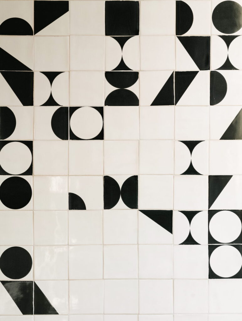
This project began without drawings, just a mood board that was still coming together. The first job was producing a layout proposals to give the design process something to work from. One of the client’s clearest notes was to bring calm chaos into the design.
Colours: 405 on a soft white PPWM base glaze.
Design: Imraum Design @gestaltung.imraum, imraum.design
Maison du Soleil, France @_maison_du_soleil_
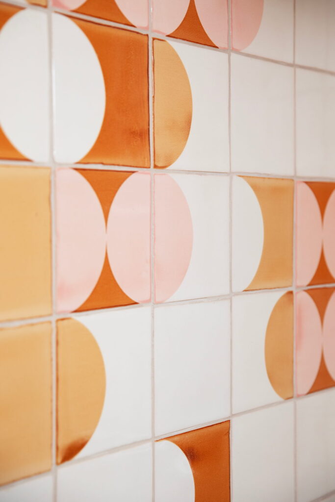
Close up you can see why the proportion of plain tiles mattered. The half-circles in orange, mustard and pink only appear as one continuous movement because the colour palette is limited to four colours and there is enough cream between them to give the design room to breathe.
Colours: 007, 008, 301 and 308 on a cream base glaze.
Photography: Miranda Koopman @mirandakoopman.photography
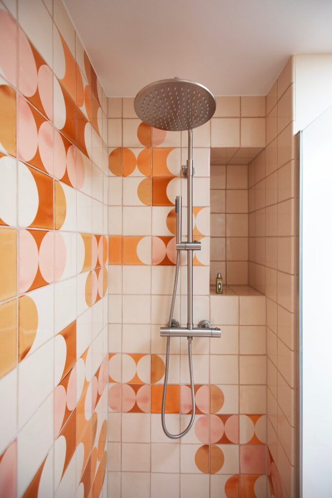
Our clients wanted warm colours and a dynamic design in their walk-in shower, and referenced two of our existing designs as a starting point. Six design iterations later we arrived at this: a pattern with a horizontal orientation that has movement and room to breathe.
Colours: 007, 008, 301 and 308 on a cream base glaze.
Photography: Miranda Koopman @mirandakoopman.photography
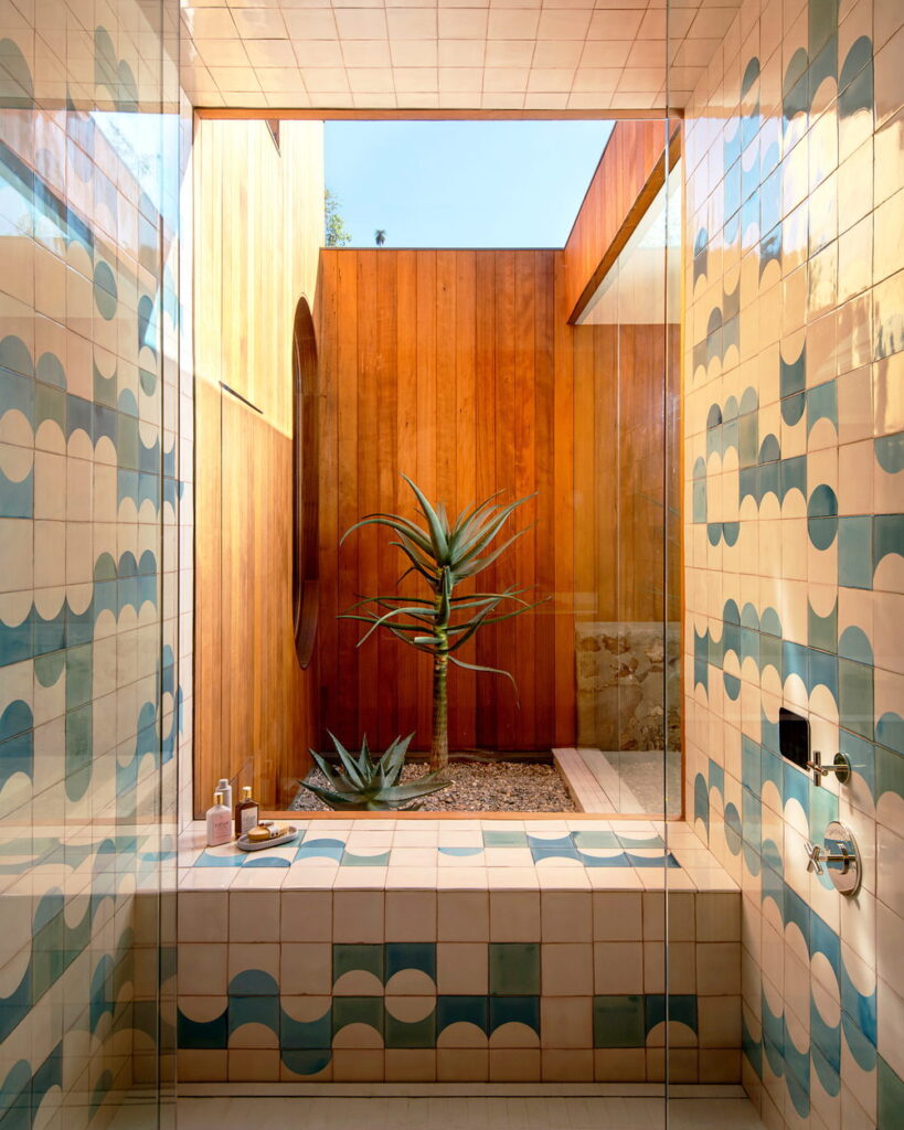
What holds this installation together is the way the screen-printed tiles group like waves. A two-sided bullnose was specified for the pony wall, which is the sort of detail nobody notices when it is done right. The shower opens onto a timber-clad courtyard, and the blue-greens hold their own against the wood in strong sun.
Colours: 506, 508, 509 on a cream PPM6 base glaze.
Design: @bestorarchitecture
Photography: @hereandnowagency
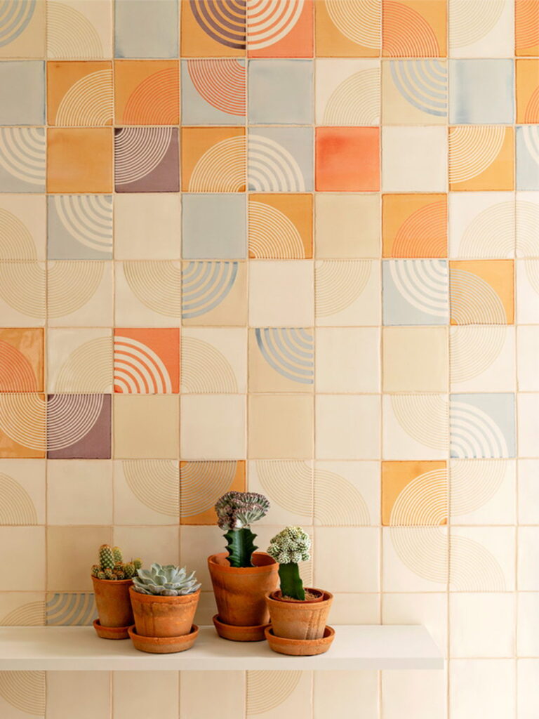
Seen close up the double screen-printing is easier to identify: two colours on one tile. The concentric circles are mixed with solid glazed tiles, which stops the wall settling into a regular rhythm.
Colours: 007, 105, 300, 309, 502 on a cream PPM6 base glaze
Photography: Juliane Eirich @juliane_eirich
Our client had just moved into a light-filled kitchen in Kreuzberg, Berlin, and wanted an accent wall in what they described as Mediterranean sunset colours. The starting point was a hand-drawn illustration of sand hills that they sent us. They asked for a pattern that was full and complex without tipping into vintage.
Colours: 007, 105, 300, 309, 502 on a cream PPM6 base glaze
Photography: Juliane Eirich @juliane_eirich
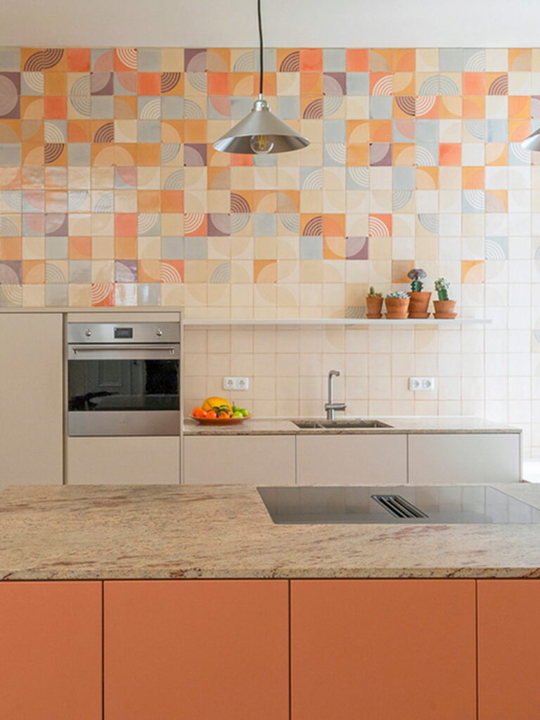
The starting point for this 7 meter-long tile installation was a design called Circus boards, which sets solid blocks and half-circles of strong colour against a white background.
Colours: 006, 208, 300, 302, 503, 508 on soft white PPWM base glaze.
Interior design: Odile Borsoni Bertière, o2b-designinterieur.com @o2b_design_interieur
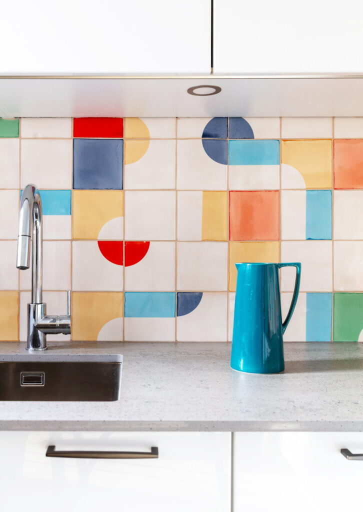
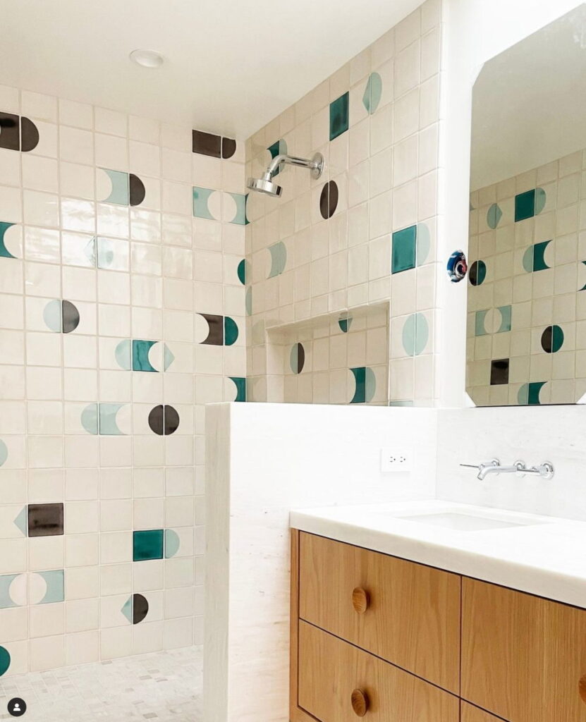
The tiles here are on the floor rather than the wall so the client chose a matte base glaze for more grip. The design is made up of half-circles that seem loose and scattered rather than in a grid. The blues are set against white in no fixed sequence, which keeps the floor lively beneath an otherwise plain wall and a simple oak vanity.
Design: @otherfields.pt
Photography: Rodrigo Cardoso
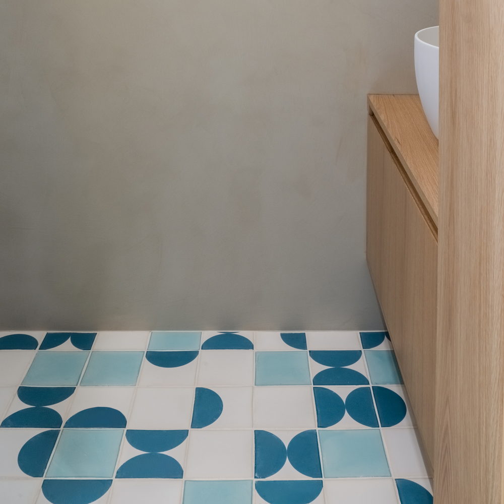
This started from a few posts the client had saved on Instagram, and the work was turning that into a layout that would work across a whole bathroom. The result is a design that runs out of the shower and tapers off behind the vanities.
Colours: 007, 008 and 308 on a PPM6 cream base glaze.
Design: Red Dot Studio, CA
Photography: Space and Light Studios
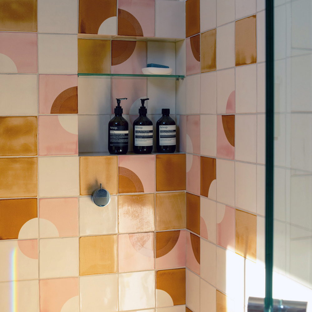
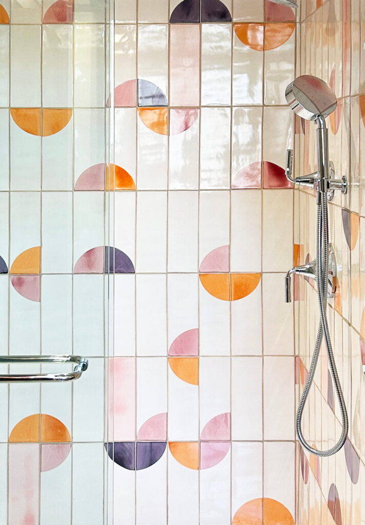
The client came to us with a Pinterest board rather than a drawing, and as usual we started by nailing down the colour selection. Screens and photographs never quite tell you what a glaze will look like on a wall, so we always send physical colour chips. The design kept moving during the design process, including a swap of which pattern went into which shower enclosure, which is the sort of change made-to-order production can absorb.
Colours:301, 304, 307, 310 on a soft white PPWM base glaze.
The brief began with a yellow and orange colourway, but the first selection carried a deep orange that made the whole wall feel heavier than intended. We replaced those darker tones with three yellows instead, which got closer to the sunshine the designer was after.
Colours: 006, 007, 010 and 106 on a soft white PPWM base glaze.
Design: Tom Scheerer @tomscheerer
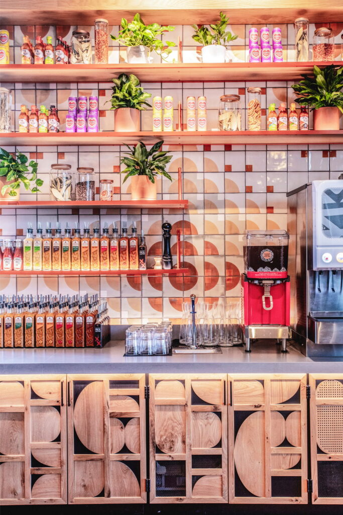
These tiles are installed in a Nando’s restaurant in Georgia, USA. Many of the tiles are double screen-printed, one colour laid over another, and where the two overlap they produce a third colour. If we do this with two colours that we haven’t tried before, we always wait with baited breath to see what new colour it produces.
Colours: 007, 008 and 403 on a white base glaze.
Design: Fusion DNA @fusion_dna
Nando’s, Dunwoody, GA, USA
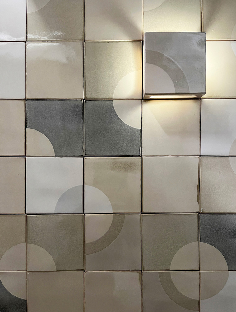
The ‘pocket tile’ in this image is a 3D ceramic tile that provides space for lighting. The glazed surface of the pocket tile can be screen-printed in any of our colours and designs in order to fit in with the overall tile installation that we design for you. Pocket tiles can be placed over wall light fittings that hold small screw-base bulbs around 5cm / 2” long, for example T25, E14 and E12 / T8 tubular LED bulbs.
Our London-based client was inspired by one particular design: Time to wind down. This design uses a mix of single and double printed tiles to create a colour-rich installation that can, as here, match very nicely with existing kitchen cupboards
Design and architecture was by Architecture 201, @arch201_gram
Photography by Fred Howarth @fh_otography.
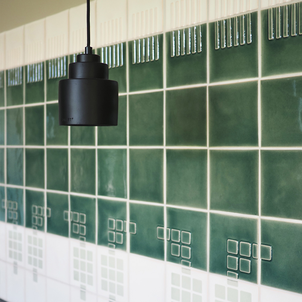
A backsplash in a domestic kitchen using predominantly Relief tiles in green glaze B089 and cream glaze PPM6. The bottom two rows of the backsplash are screen-printed in colour 403 on a cream PPM6 glaze. The tiles at either end were made slightly wider to perfectly match the width of the countertop. Bullnose tiles were used along all edges.
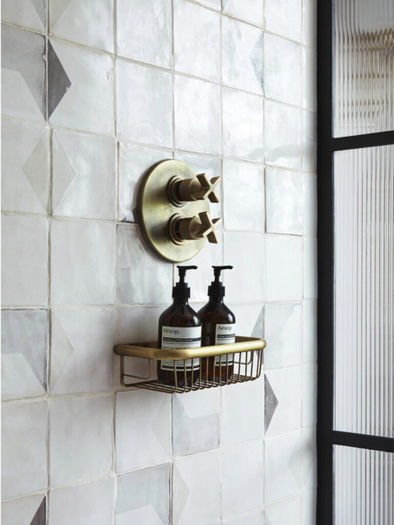
Light pouring through the windows of this chic bathroom emphasis the handmade nature of our tiles. Designed by London agency Run for the Hills, the spacious design and neutral colours of the tiled walls feel calm and understated.
www.runforthehills.com
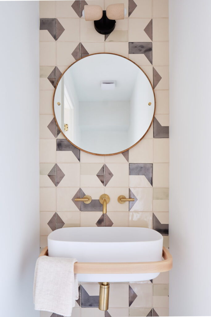
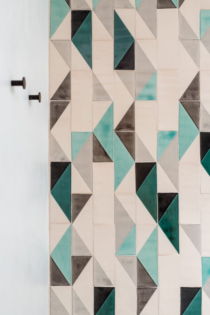
This subtle powder room with it’s rounded mirror and curved washbasin has a back wall creates a little bit of drama with more angular shapes on the back wall. The shapes are screen-printed in brown, light grey and taupe onto handmade tiles with a cream base glaze.
Design by Studio Fauve @studiofauve
Photography by Van Sarki @vansarki
This fireplace project was designed around the existing wall structure. By embracing the constraints of the fireplace width rather than fighting them, we were able to create a layout that allows the pattern to wrap naturally around the corners using tiles that were custom-cut to size at the factory.
Colours: 105, 304, 502, and 503 on a soft white base glaze.
Interior design: Wong Interieurs (wonginterieurs.nl)
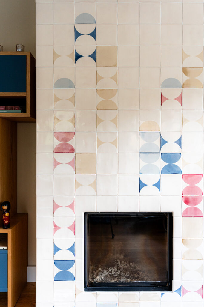
These tiles are located in the historic ‘The White Building’ in downtown Santa Fe, California. The building has a rich history as a home, studio and sanctuary for prominent women who shaped local culture, religion, and business. The richly coloured tiles are a contrast to the exterior walls that give the building its name. The rounded shapes are screen-printed in colours 205, 300, 302, 505 and 506 on a cream base glaze. Some tiles are single screen-printed (the ones with the cream quarter circle) while others are double screen-printed, creating new colours in the overlapping areas.
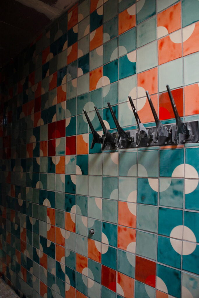
This bathroom wall suggests waves on the surface of the sea, which is appropriate because the villa is located in Ibiza. Rectangular tiles (30x10cm / 12×4″ approx) emphasise the height of the bathroom and contrast to the minimalist white walls.
Interior design: @cancandesign_ and @box3ibiza
Photography: @analuiphotography
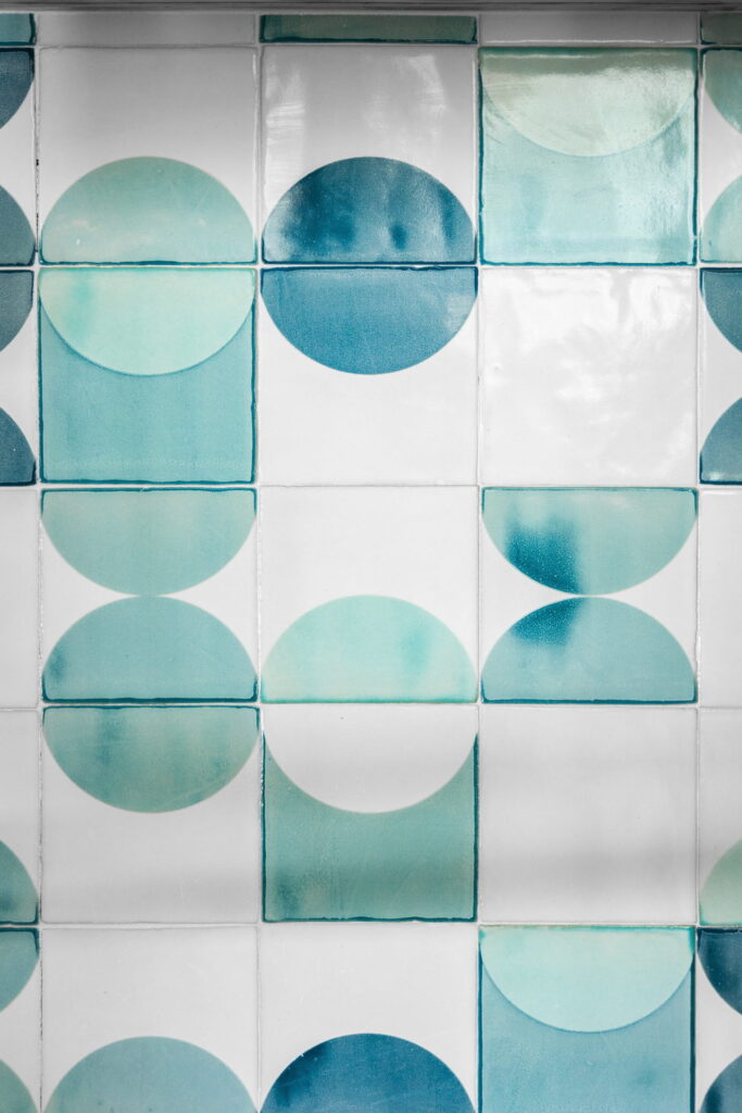
A kitchen island can offer more than practicality. It’s also an opportunity to bring in colour and warmth. This kitchen, designed by Kaitlyn Wolfe, uses blues and greens in rounded shapes to soften the feel and reflect soft natural light back into the room. Screen-printed colours can have a water colour quality which emphasises the softness of the design without impacting the hard-wearing nature of glazed ceramic tiles. The colour palette here is relatively restrained with 200, 201 and 506 on a soft white base glaze.
Interior by Kaitlyn Wolfe
Photography by Kevin Brost
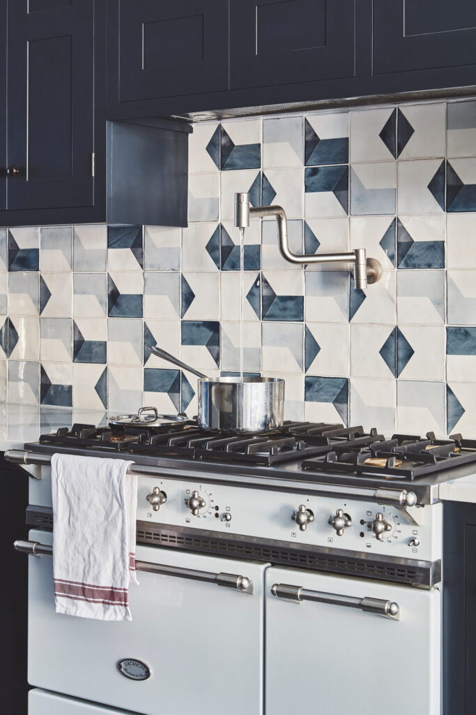
This kitchen was designed by Blakes London and features Smink Studio screen-printed tiles in an angular pattern of blues and greys. The shapes combine to form diamonds and the pattern is regular but not rigid.
www.blakeslondon.com
Photo by Malcolm Menzies
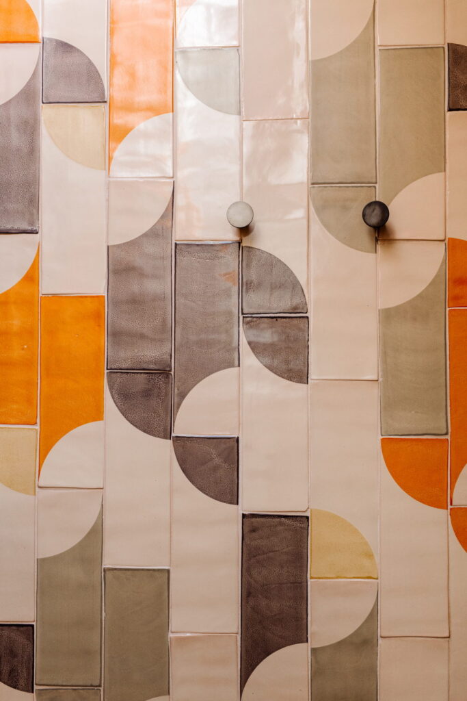
The second bathroom that is decorated with screen-printed tiles in this Ibizan villa uses rounded shapes and warm colours and evokes the warm sands of Ibiza’s countless beaches. Orange, brown, grey and yellow are screen-printed onto rectangular tiles arranged vertically to emphasise height.
Interior design: @cancandesign_ and @box3ibiza
Photography: @analuiphotography
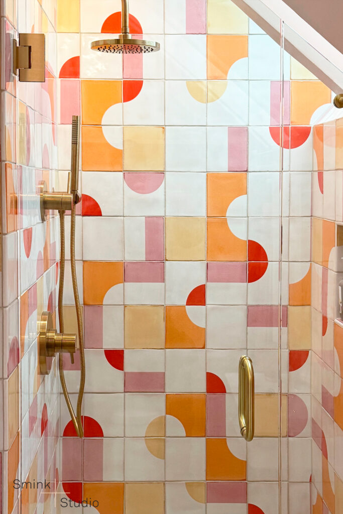
Showers can be playful and tiles offer a way to play with mid-century modern themes. The screen-printed shapes gain intensity from the spacious design with plenty of solid white tiles. Regan Baker Design chose a watery blue color palette to stand out against the white, keeping the space feeling bright and contemporary.
Colours: 205, 409 and 505 on a soft white base glaze.
Interior by Regan Baker Design @reganbakerdesign
Photography by Jessica Burke
The design process began with the interior designer selecting our tiles after discovering them on Instagram, allowing us to build a custom layout proposal specifically for the project’s dimensions. Bullnose tiling around the niche and vertical edges provides a satisfying, rounded finish. The niche was in fact custom-designed, its height determined by the specific height of the homeowner’s shampoo bottles!
Colours: 006, 301, 302, 304 all on a soft white base glaze.
Interior design: Alexandra Immel Design, Seattle, WA,
Construction: All Aces Construction
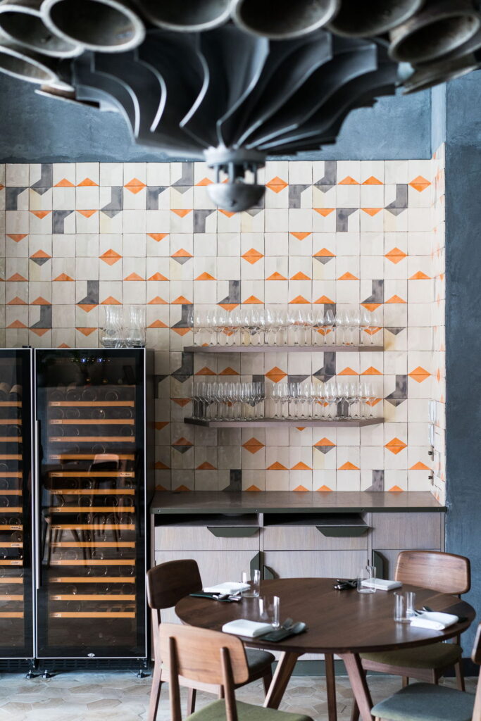
Screen-printed Smink Studio tiles adorn the walls of London restaurant Londrino. The tiles are screen-printed in grey and orange in a loose pattern of angular shapes. Londrino serves Portuguese food, which is a happy coincidence as our tiles are handmade in Portugal.
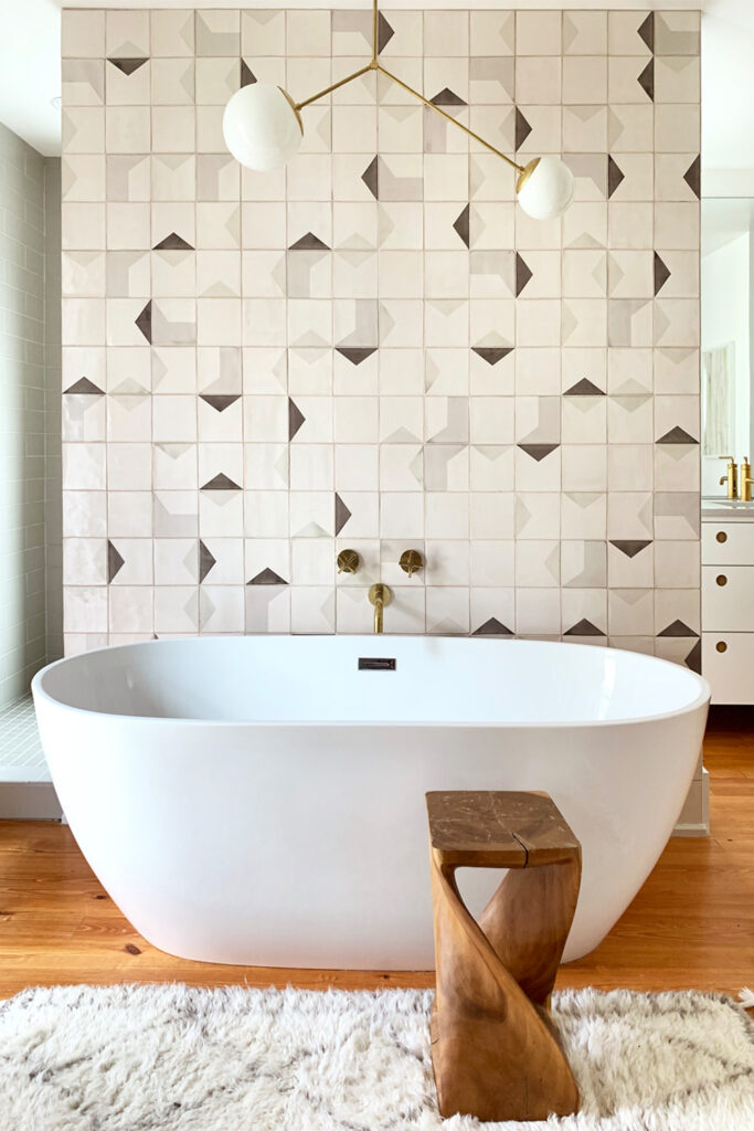
This bathroom wall sits behind the bathtub but is detached from the side walls to create an intimate but slightly open space. It is tiled in a subtle, angular design using grey and brown. The pattern is random but calm and the effect on the bathroom is understated sophistication.
Photo & Interior Design by Second Mile Designs – USA
Architecture by AOA – Ashley Oz Ozburn – USA
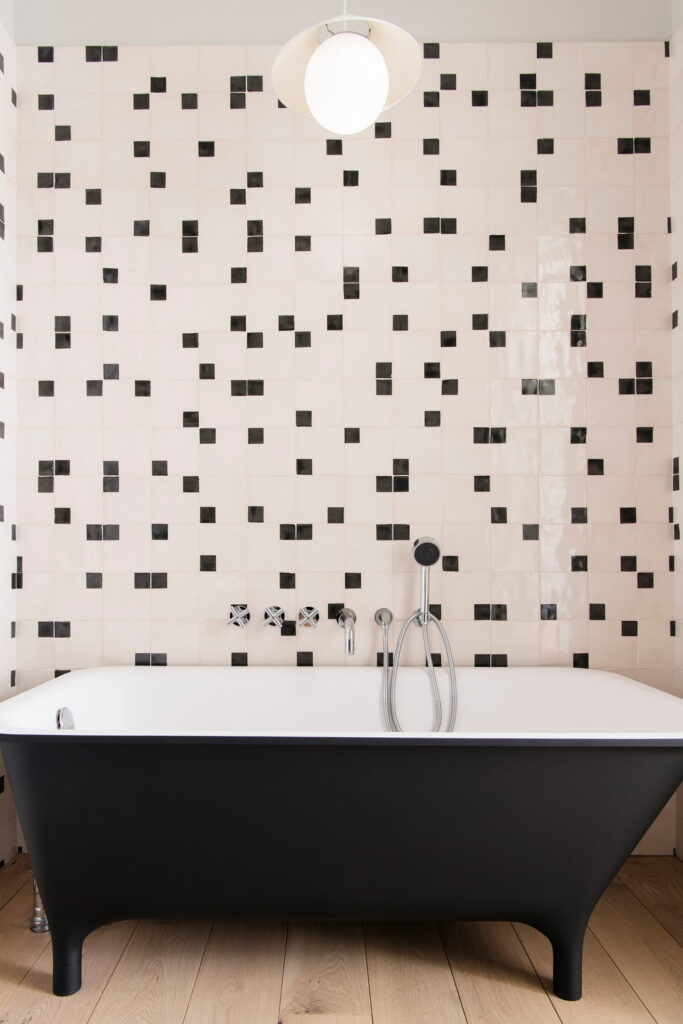
This is a modern twist on the classic black and white bathroom. The tiles are screen-printed with small black squares and arranged in a random pattern so that they sometimes touch. The impact is calm and a little unusual, with the black of the screen-printed tiles echoing the exterior of the bathtub. Interior design is by Elizabeth Roberts Architects (@elizabeth_roberts_architects) and photography is by Dustin Aksland (@dustinaksland).
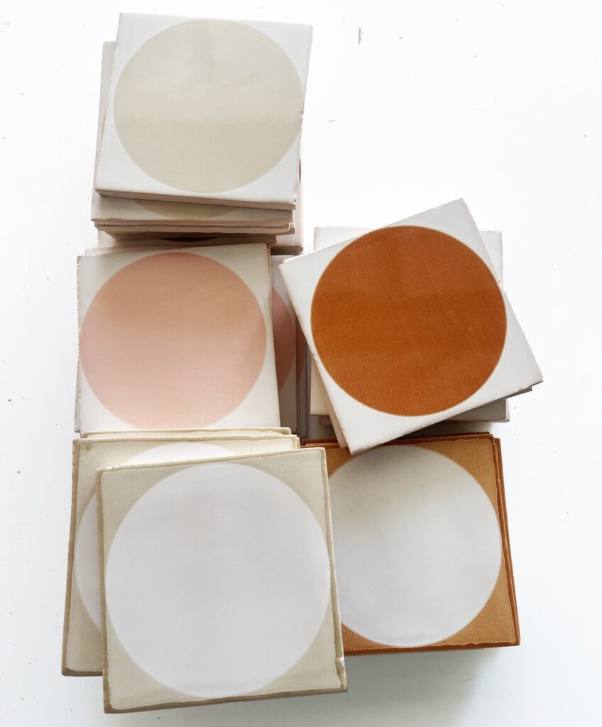
Full circle tiles are a more recent addition to our collection. The circle itself can be screen-printed or the space surrounding the circle. And if you want to get creative then both can be screen-printed in your choice of different colours. Our made-to-order production means that choosing tiles with us is very different to choosing tiles at your local showroom.
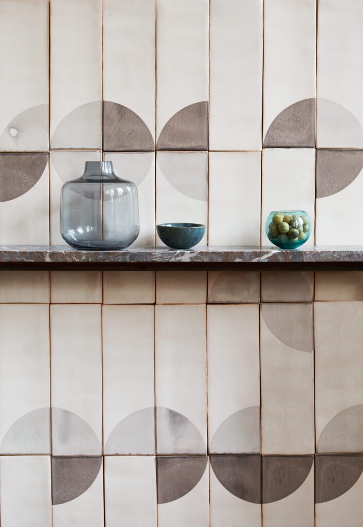
Our rectangular tiles (30x10cm / 12×4″ approx) can be arranged in a design of parallel rows, half-drop or, as here, staggered one-third drop. Each option creates new shapes and suggests new possibilities.
Colours: 005, 101, 304 on a soft white PPWM base glaze.
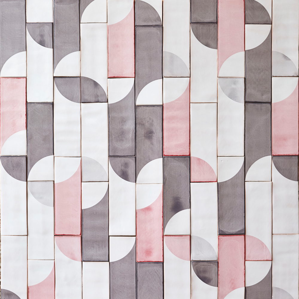
Our rectangular tiles (30x10cm / 12×4″ approx) are here arranged in a pattern that brings together the quarter circles in almost (but not quite) circles. The random, unpredictable element of this (and most) Smink Studio designs keeps the eye travelling across the surface of the tiles.
The screen-printed colours are 101 and 005 on a cream PPM6 base glaze.
Brochures (PDF)
Instructions / installation guides
Terms and conditions
Newsletter
© Smink Studio | Terms & Conditions | Privacystatement